Accessibility that sticks
Two projects, one lesson. At Crédit Agricole, 300+ accessibility defects taught us that fixing bugs one by one doesn't work: the process has to change. At Sky we applied the same approach and measured it. Compliance went from 50% to 85%, with two touchpoints at 100%.
- Projects
- Crédit Agricole (2025 - Now), Sky (Sep 2025 - Oct 2026)
- Role
- Accessibility lead & UX/UI Designer
- Standards
- WCAG 2.2, UNI EN 301 549
Crédit Agricole
A banking app with 300+ accessibility defects, and the decision to stop fixing them one by one.
The problem
We didn't have a bug problem. We had a process problem.
The audit of the app's core templates found over 300 accessibility defects. The workflow was "fix it at the end": design, develop, test, and only then discover what doesn't work. Which meant:
- Costly revisions: endless back and forth between designers and developers.
- Delayed releases: UAT kept getting blocked by critical accessibility issues.
- Compliance risk: no way to guarantee an inclusive experience for everyone.

The idea
From patching to prevention
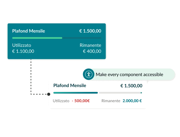
The issues kept coming back because they were born in the UI kit itself.
So I proposed a shift: from a standard UI kit to an accessibility-first design system. Developers receive components that are already compliant, and the room for error gets a lot smaller. In other words: shift left.
What we built
The Accessibility Kit
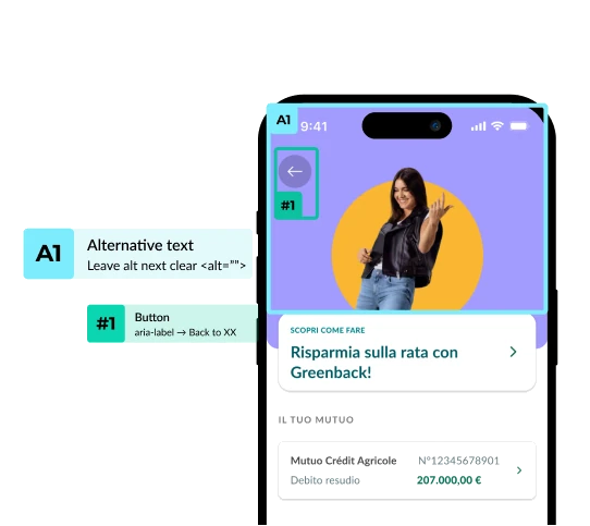
A handoff framework that tells developers exactly how each component has to behave:
- Semantic annotations: screen reader labels, roles and traits for every element.
- Focus order: the logical path for keyboard and assistive technology users.
- Redlines and touch targets: minimum hit areas and contrast ratios.
- States: hover, focus, active, disabled. Every state defined, no guessing.
The kit is being rolled out screen by screen. The target: about 80% fewer accessibility bugs in UAT.
Sky
The same approach on a media brand, and this time we measured everything. September 2025 to October 2026.
The starting point
Half accessible isn't accessible
Seven Sky touchpoints met about half of the applicable criteria of UNI EN 301 549, the European standard that includes WCAG. We measured one simple thing: criteria passed ÷ applicable criteria. Easy to repeat, easy to explain to people who have never heard of WCAG.
What I did
Audit, fix, review, teach
-
Audit
Every touchpoint checked against UNI EN 301 549, criterion by criterion.
-
Design fixes
Contrast, focus states, labels, reading order, touch targets. Fixed in the design first, with the same kind of annotations we built for Crédit Agricole.
-
Review
Design and development reviewed against the criteria, so the fixes actually made it to production.
-
Training
Sessions with the developers on the why, not only the how. Bugs stop coming back when the people writing the code know the reason.
What changed
Seven touchpoints later
85%
MeasuredUNI EN 301 549 compliance across the seven touchpoints.
2
Touchpointspass every applicable criterion.
Developers trained on accessibility, so new features start from a better place.
What I learned
Fixing is the easy part. What makes accessibility stick is moving it earlier, into the components, and explaining the why to the people who write the code. And talking about it in the language of the business: fewer blocked releases, less rework, lower risk.